Why do smart home apps all look the same? For GROPYUS, I tried to make Building OS feel sharper, clearer, and easier to live with.
We had one month to give Building OS a new visual direction. Not a full redesign fantasy. A real product, with real constraints, moving fast.
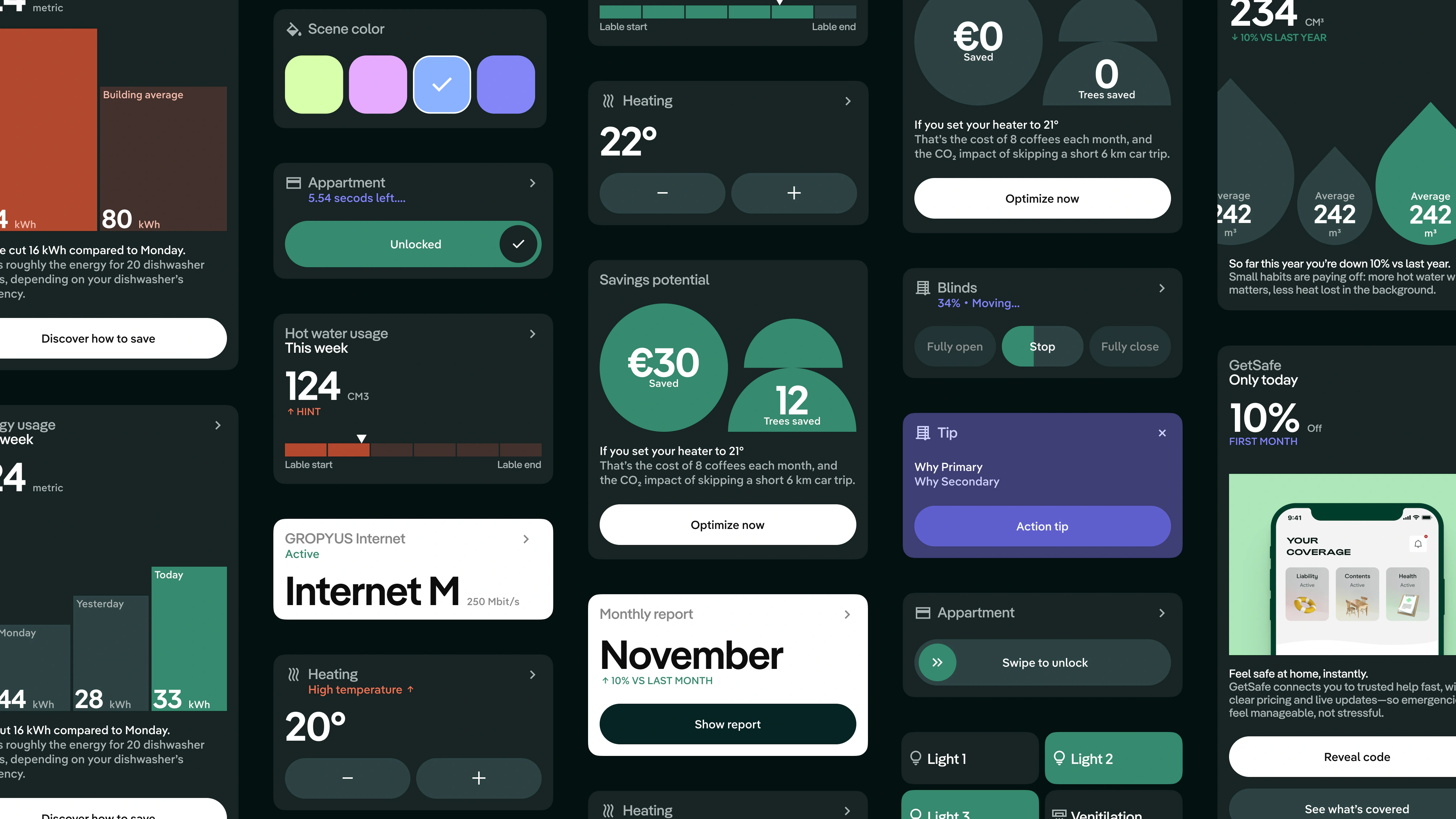
I led the visual design and supported UX improvements across the main tenant experience: home, devices, controls, services, and the first ideas around energy consumption. The goal was simple to say and harder to do: make the app feel more mature without making it boring.
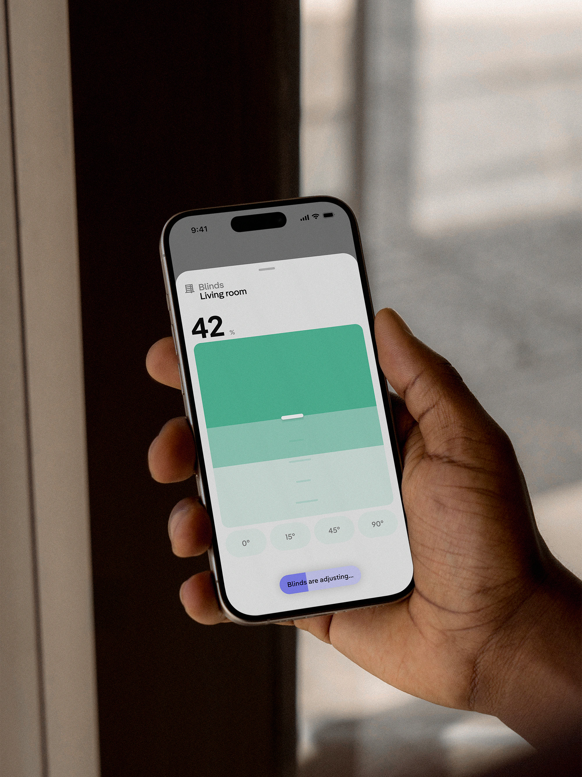
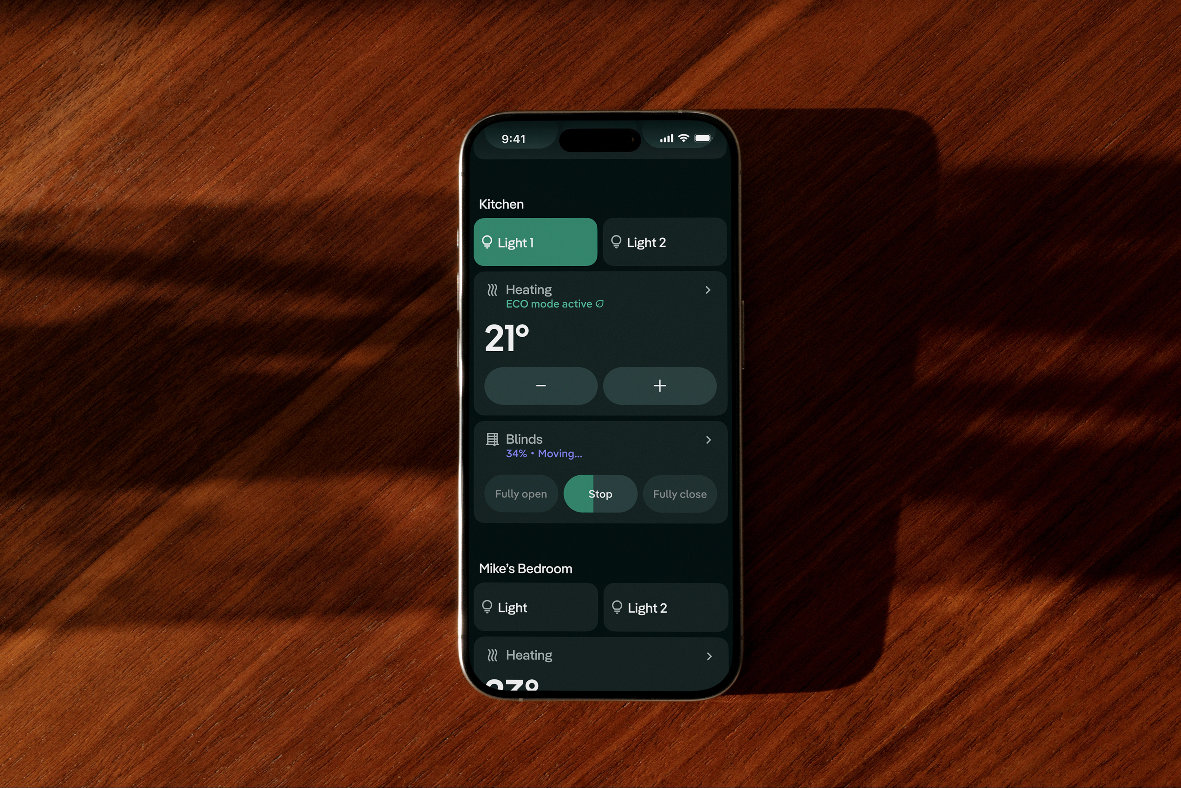
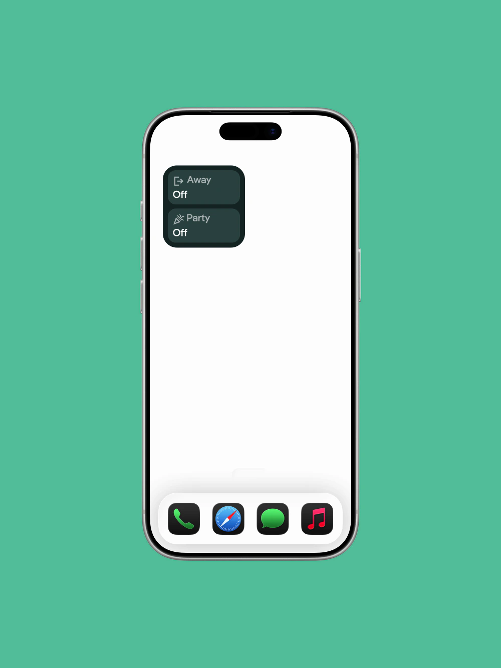
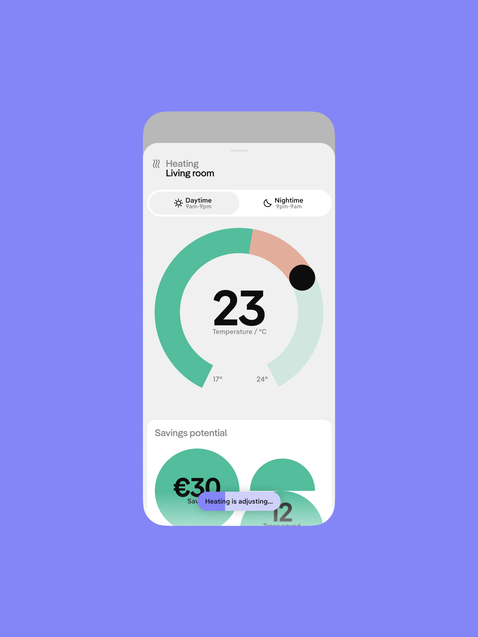
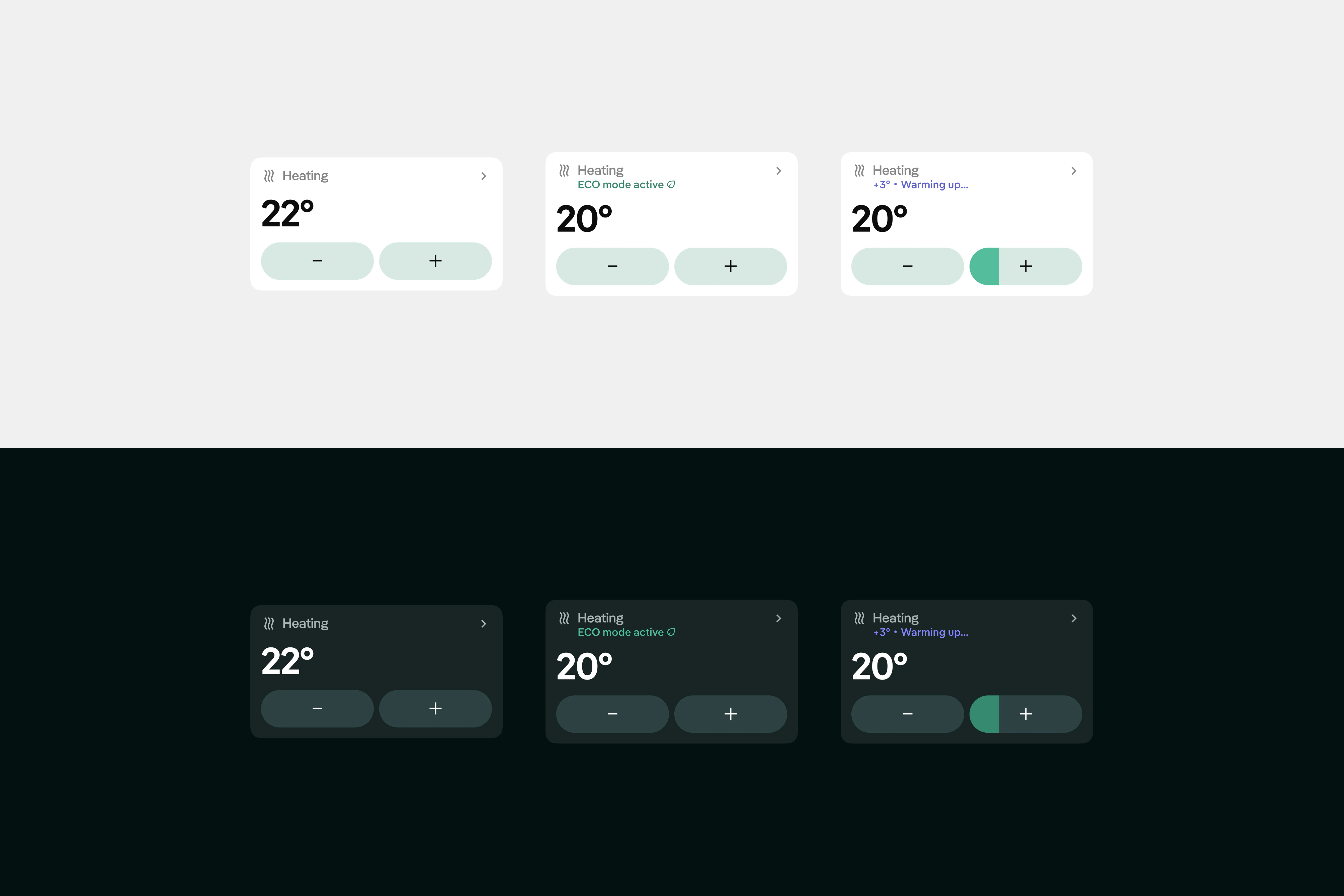
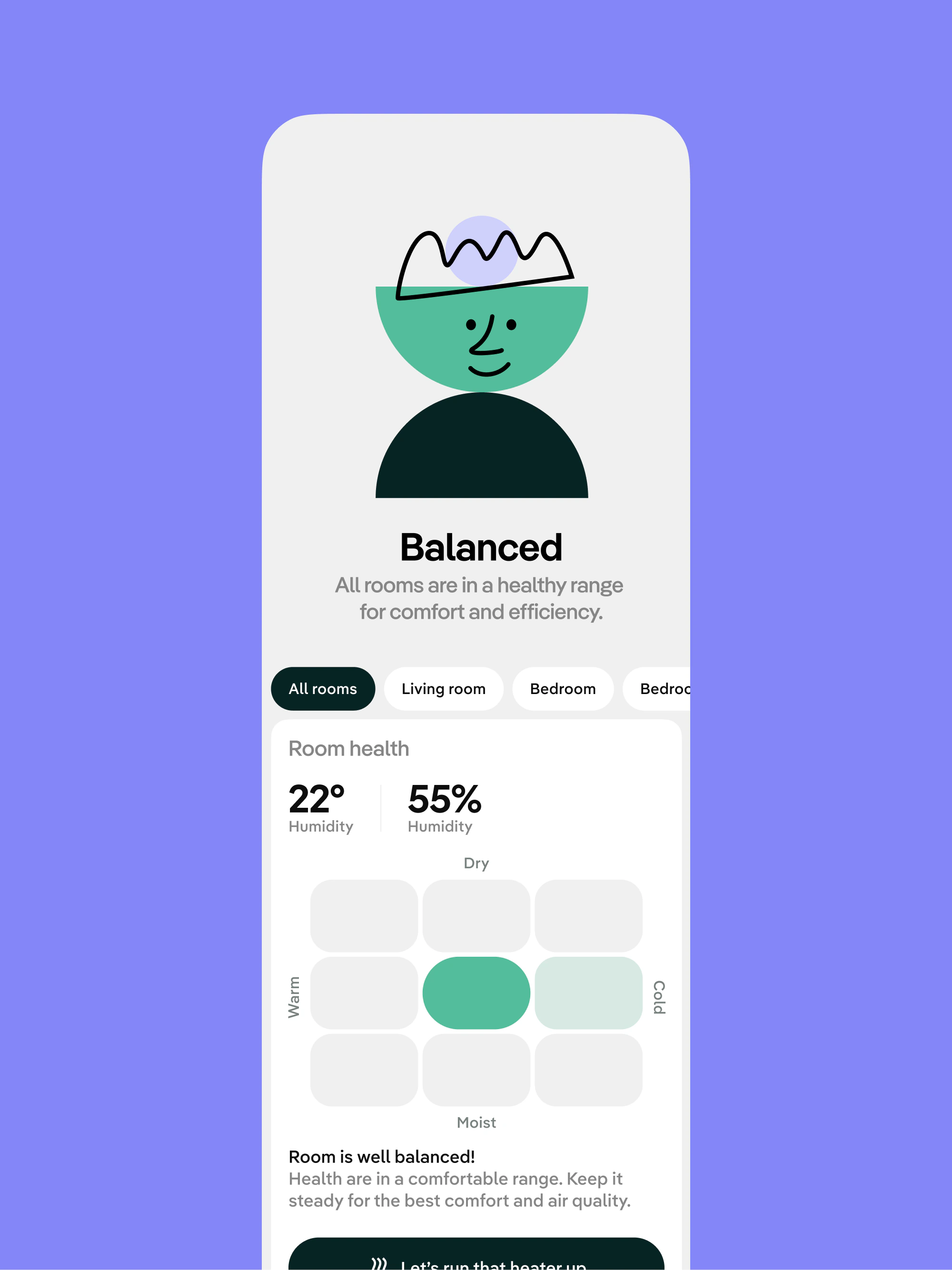
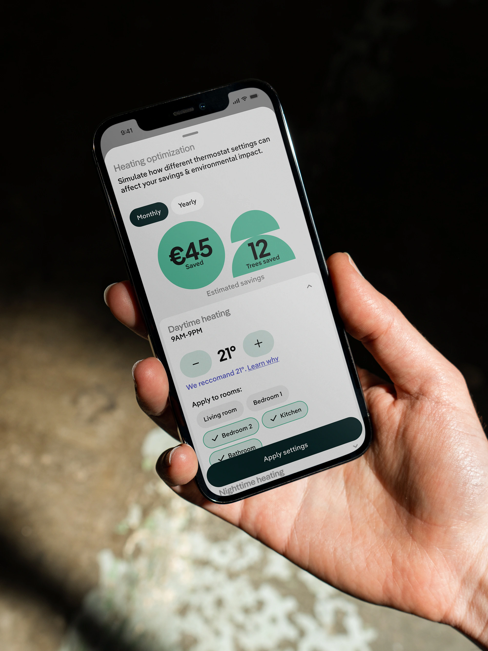
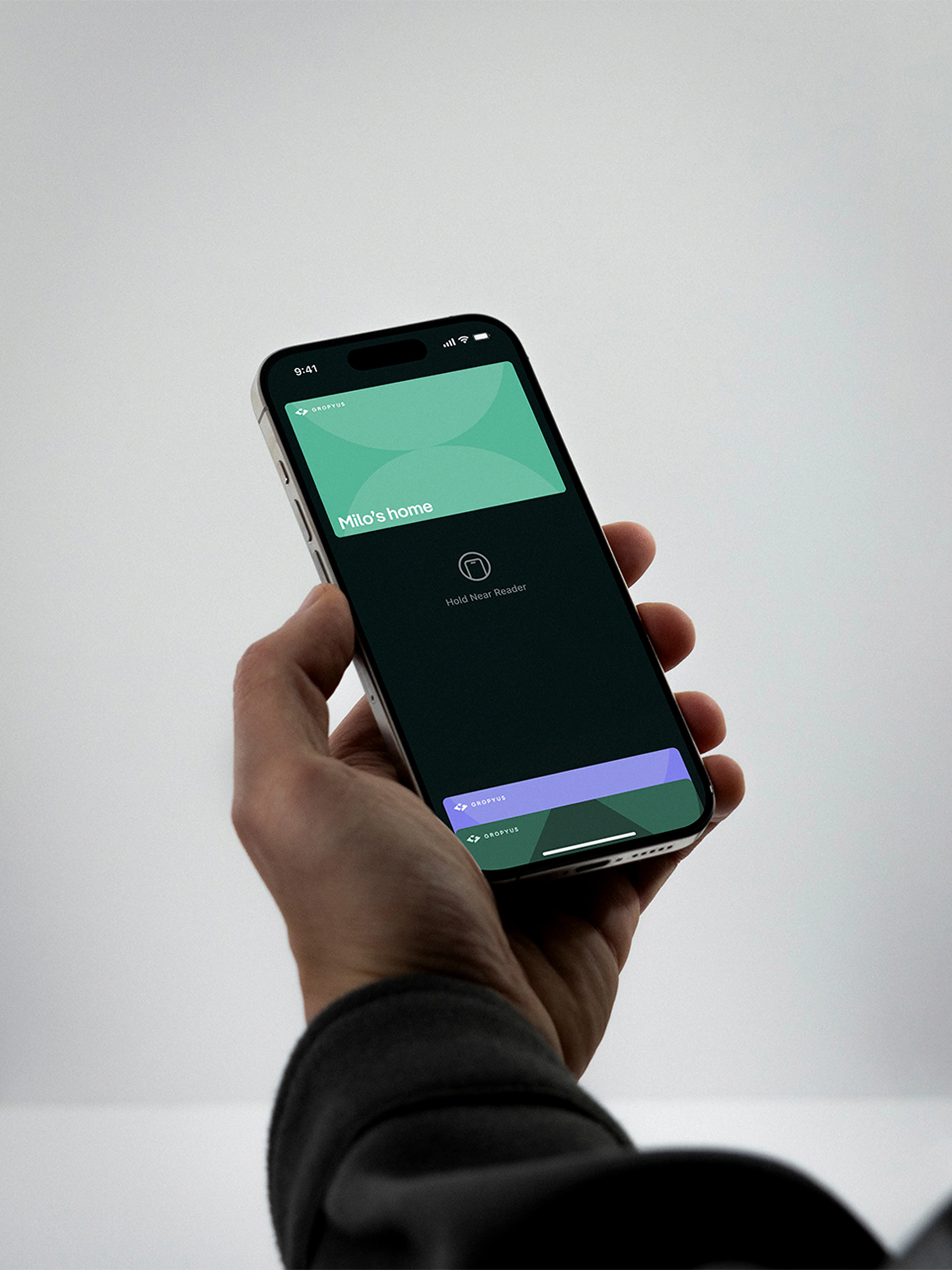
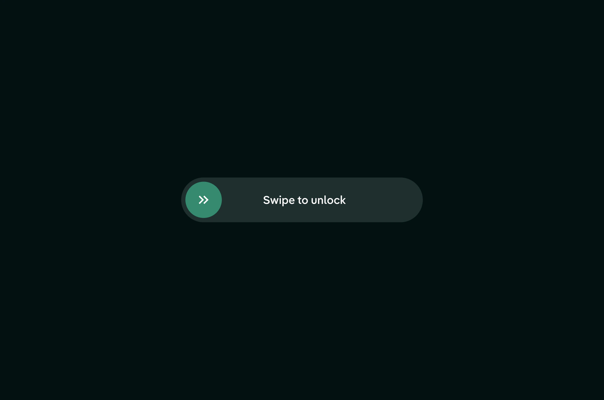
The existing product worked, but some parts asked too much from the user. Important actions were hidden behind gestures. Device controls looked clean, but not always obvious. Blinds felt refined in motion, then slower when you just wanted the room darker. A home app should not make you feel like you need a manual.
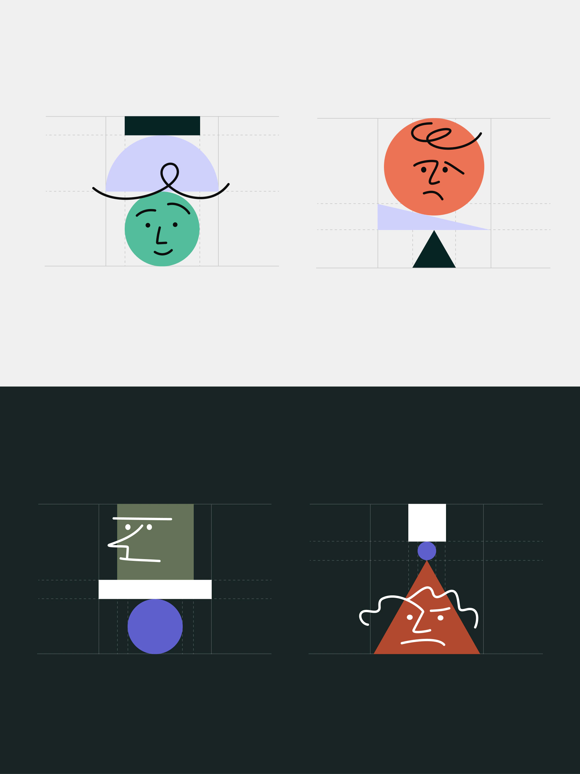
Before choosing one direction, we pushed many. Some were too soft. Some were too cold. Some looked like every other smart home app pretending to be neutral. The direction that stayed had a Swiss base, but with more edge. Clear, structured, a bit bold. More GROPYUS.
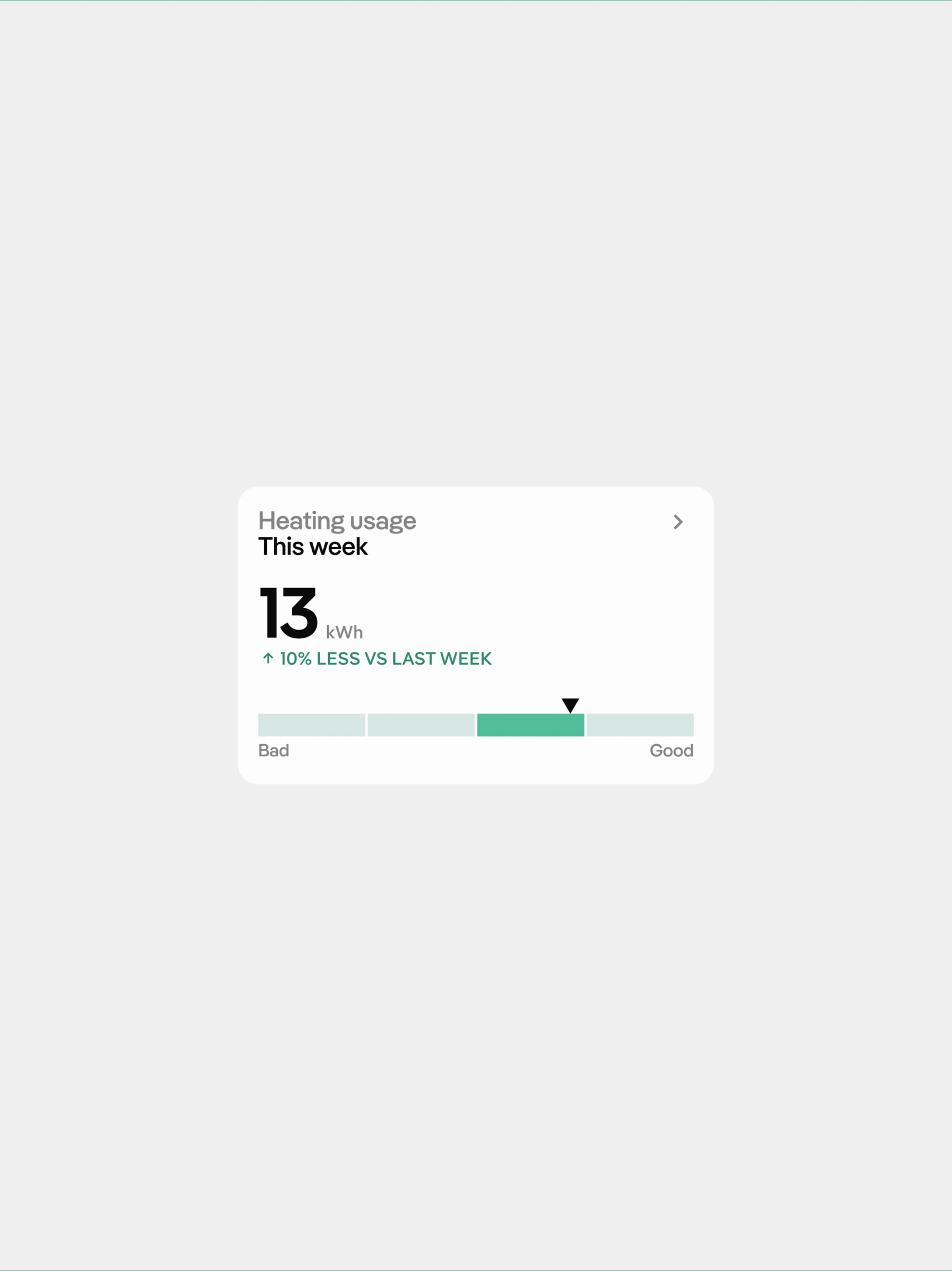
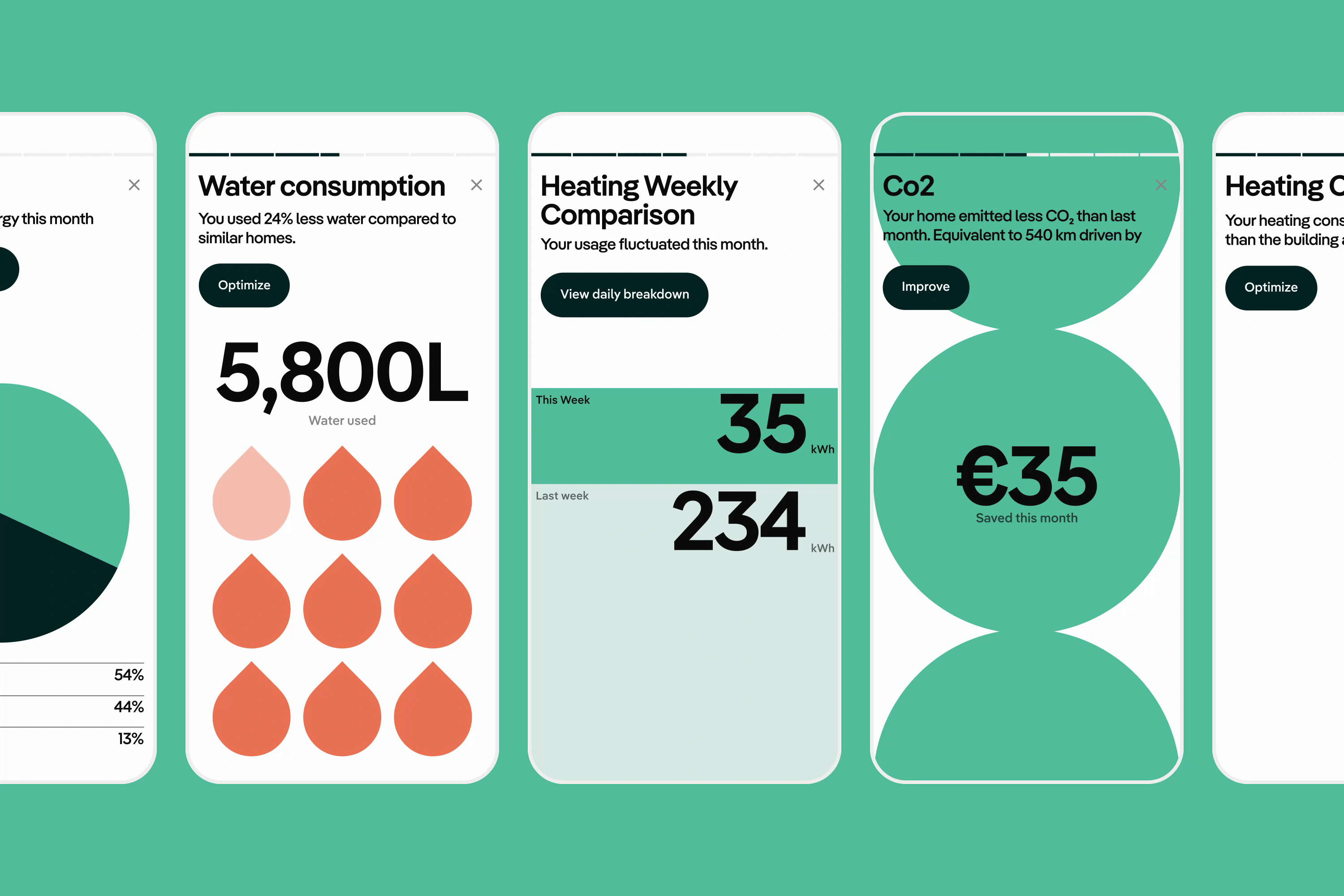
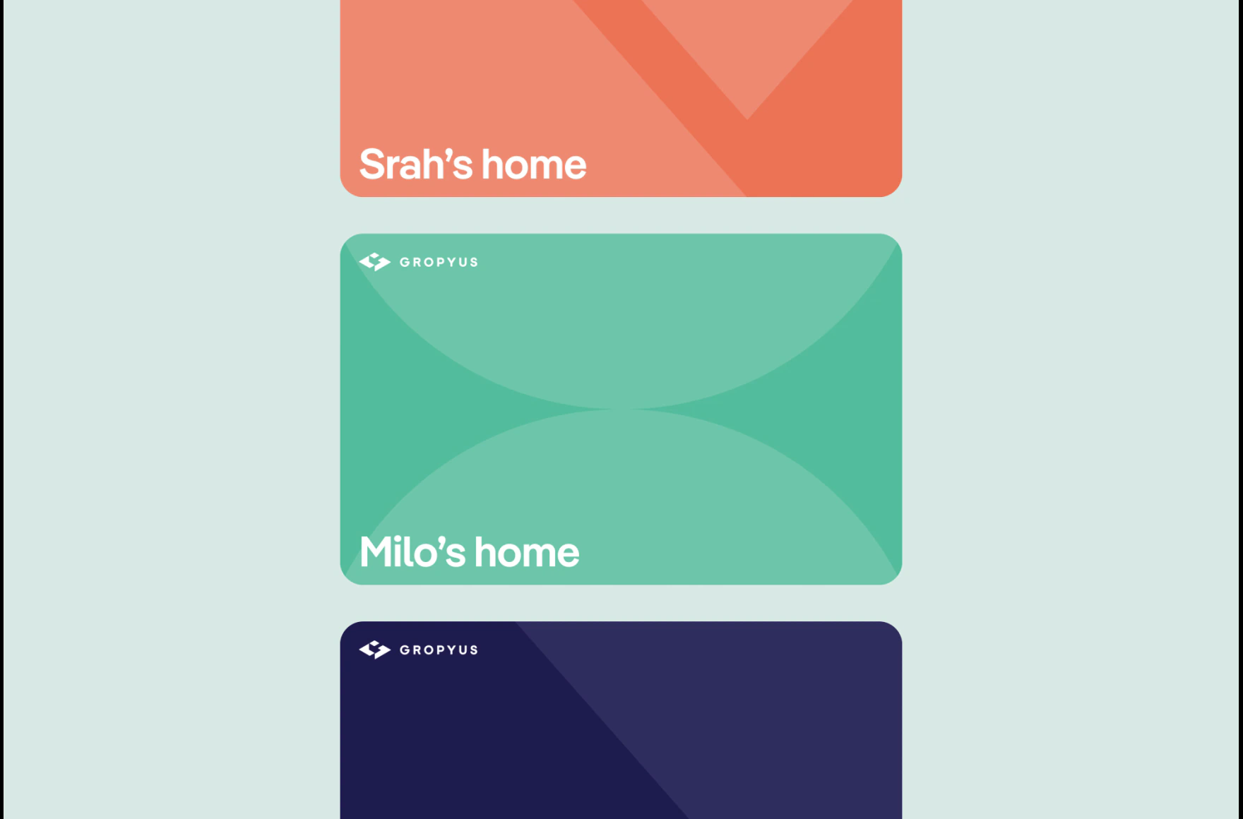
The biggest piece was the card system. It gave the product one flexible pattern for content, controls, states, and actions. Not because cards are magic. Because starting from zero on every new feature is how products slowly become messy.
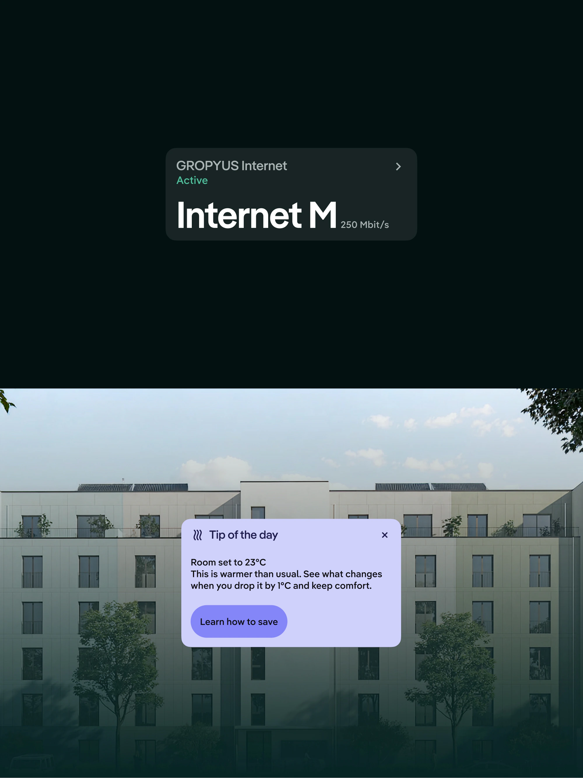
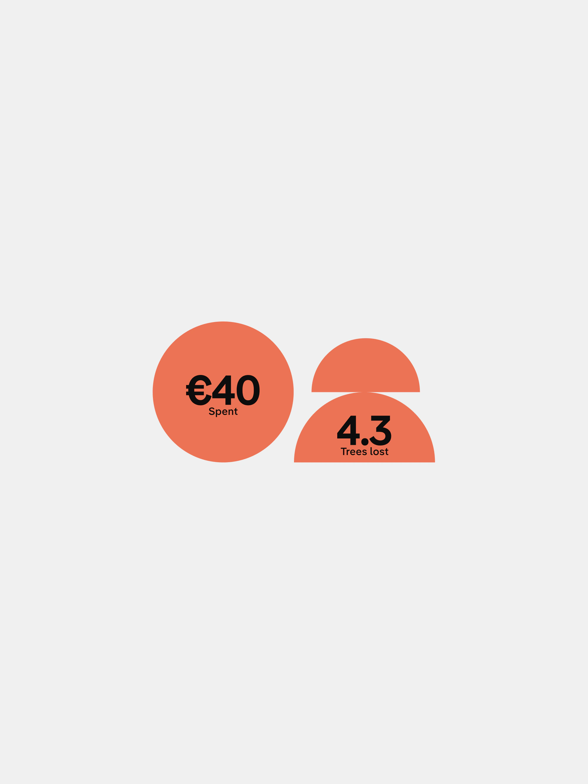
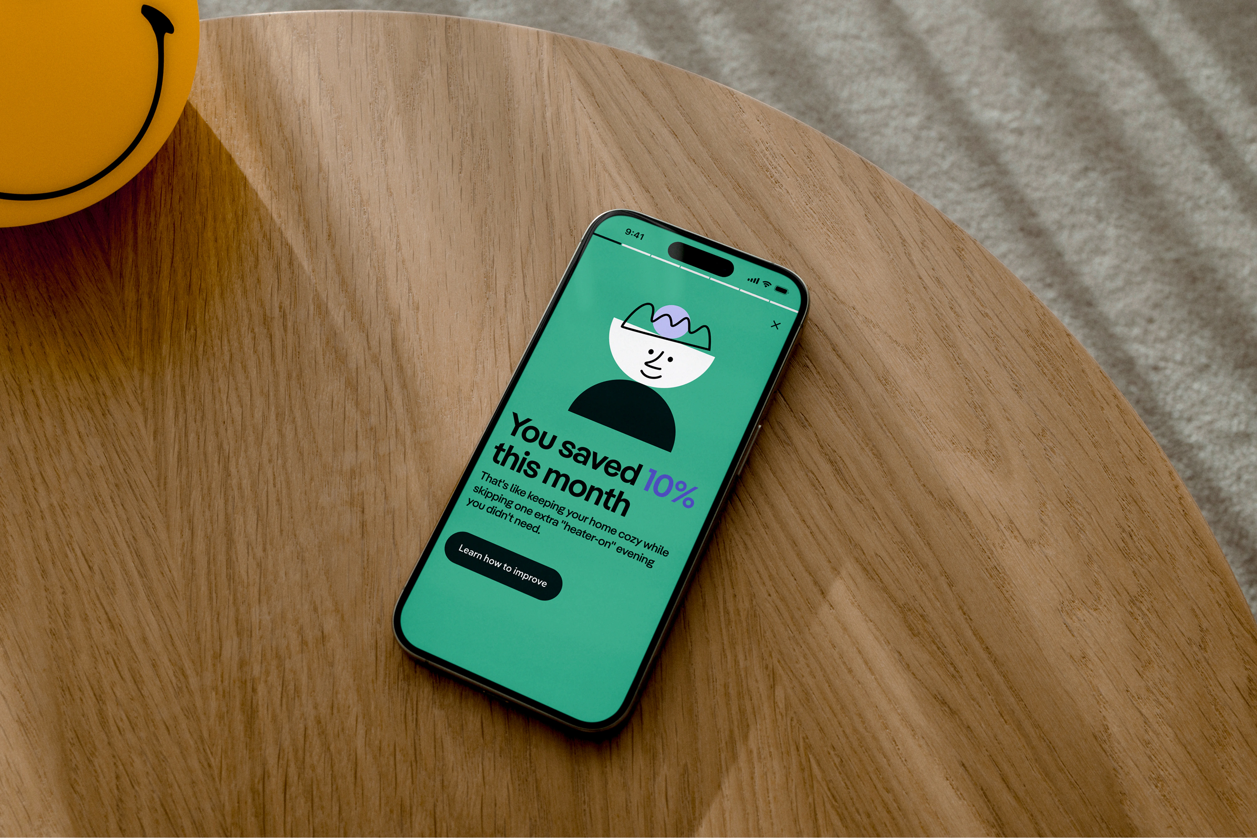
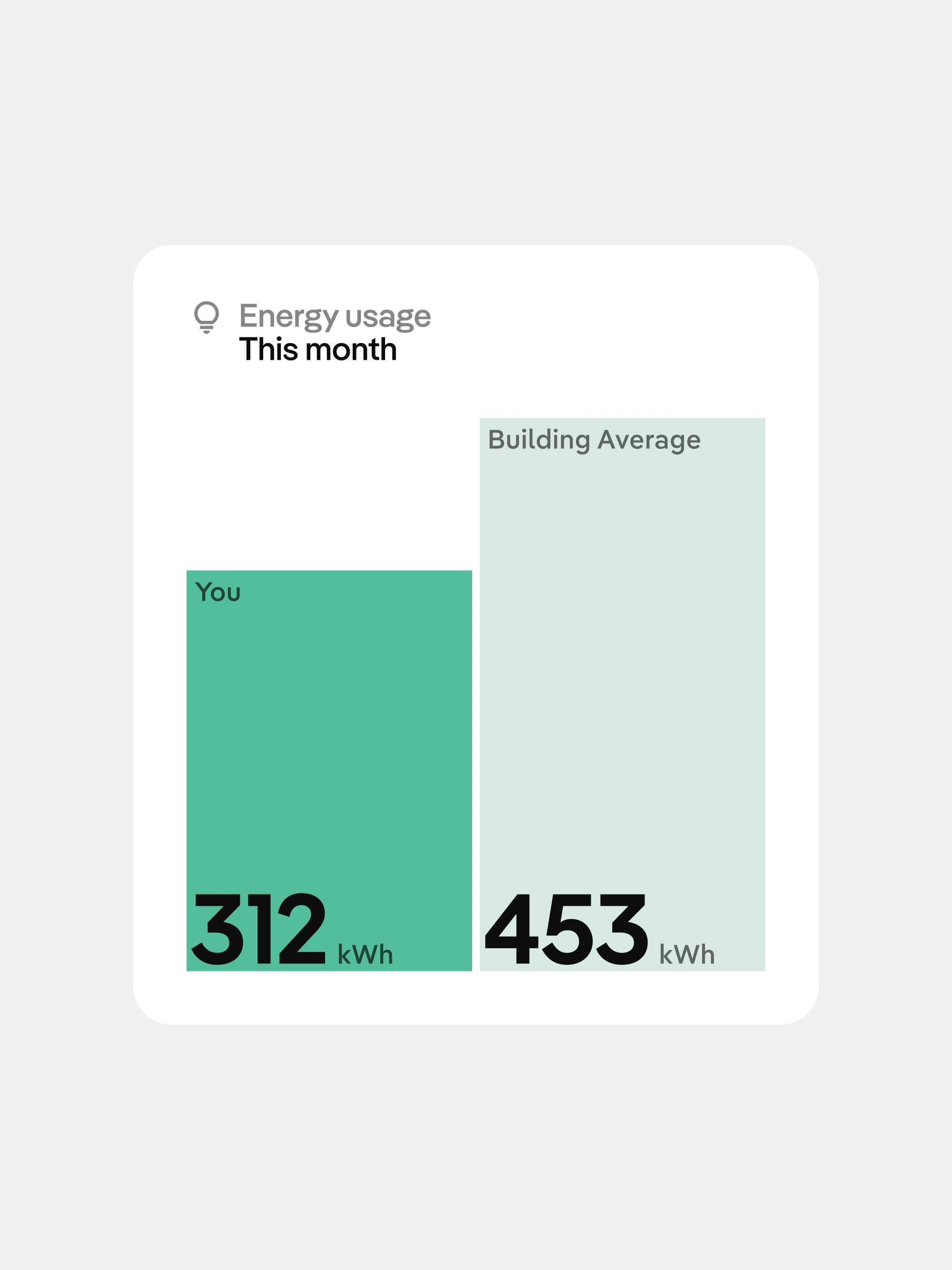
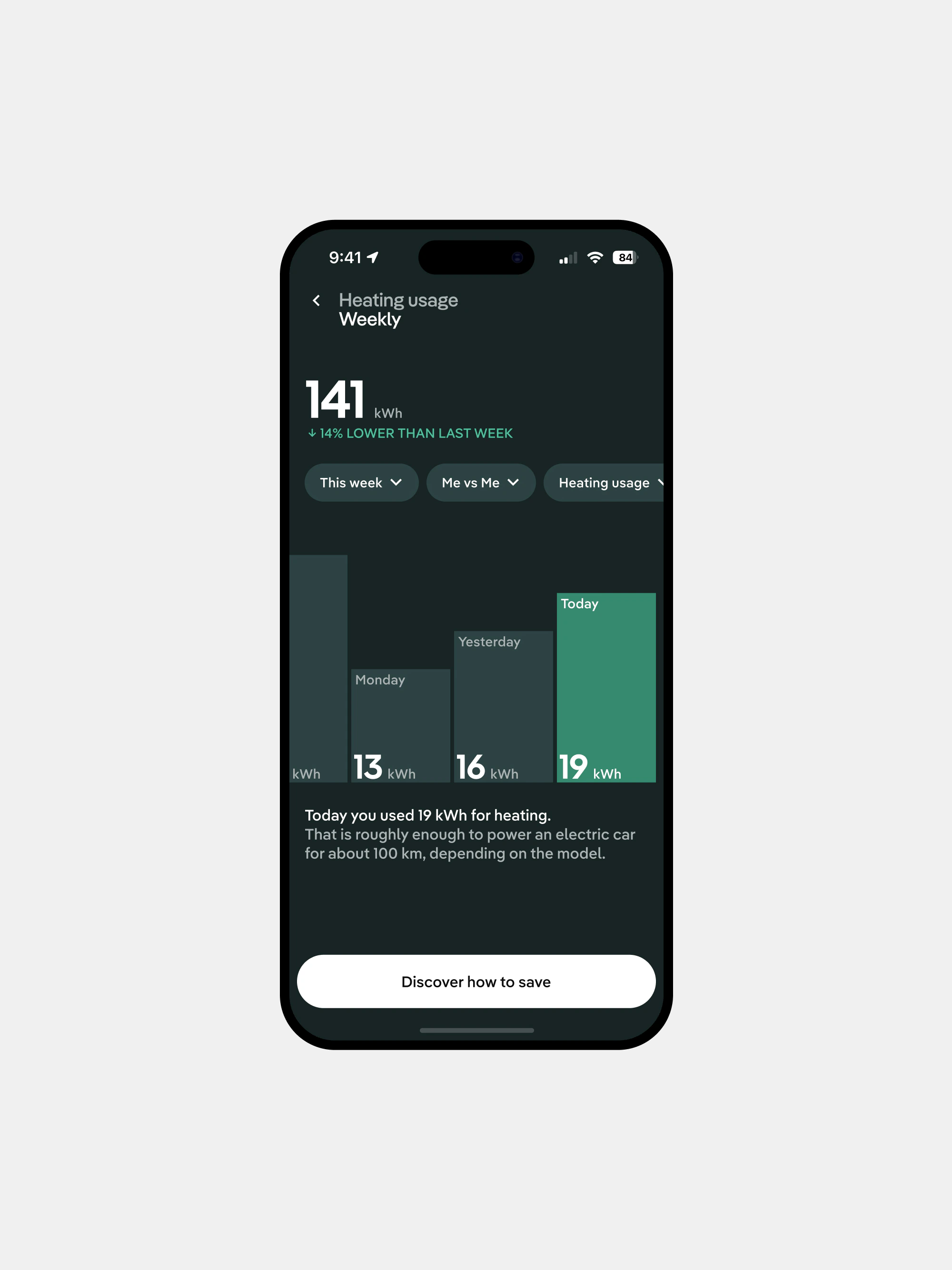
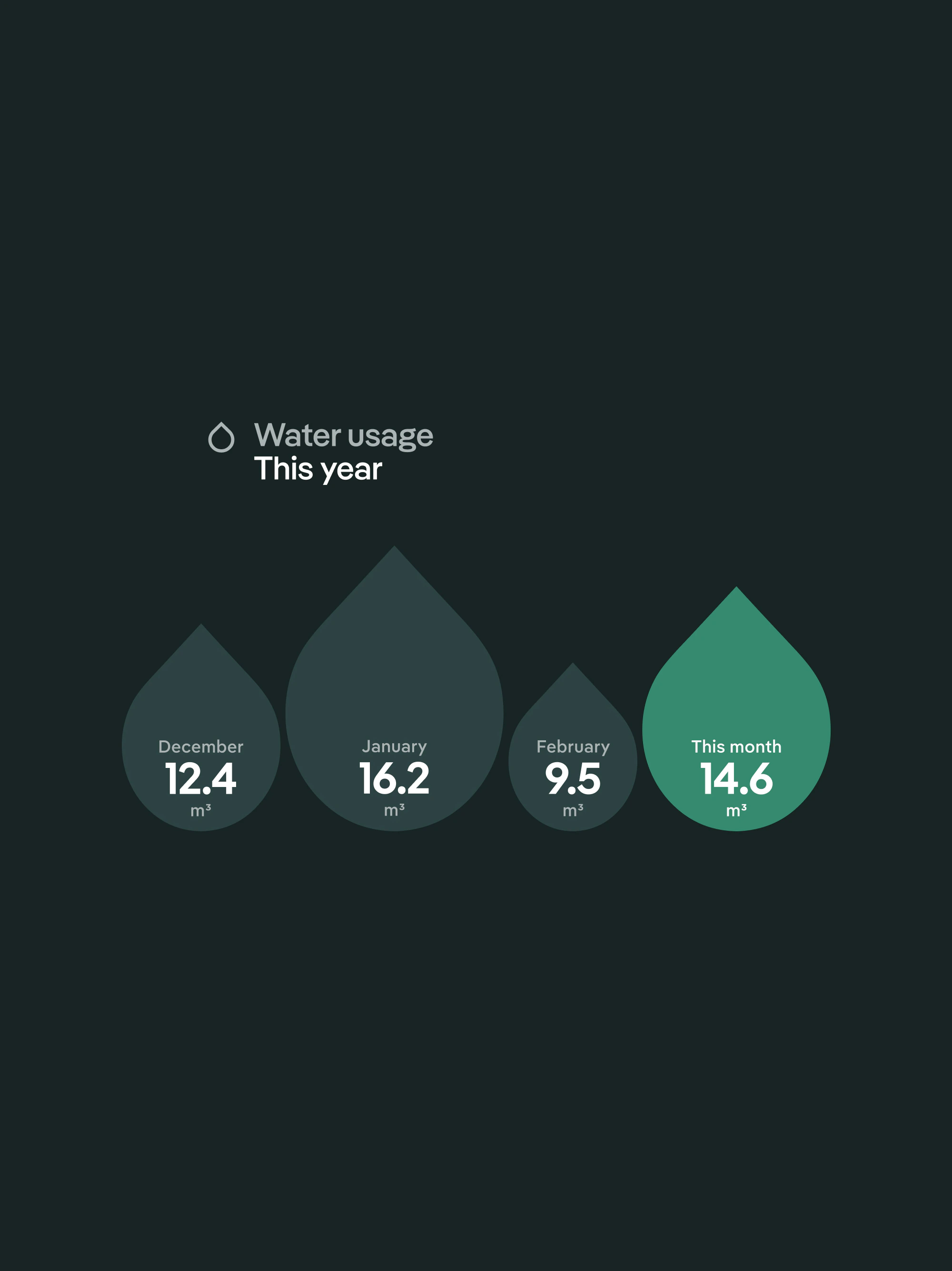
We also looked at sustainability as something more useful than a nice sentence. People do not need vague encouragement. They need to see what changed, what it means, and what small action is worth doing this week.
The app is not finished, and it should not pretend to be. This work gave the product a direction it can grow from: clearer controls, stronger hierarchy, and a visual language ready for the next features without another reset.