A visual and UX refresh for Descartes, focused on standing apart from typical finance products while staying simple to use.
Descartes was already on the web, with marketing pages, a blog, and a logged-in cockpit, by the time this phase started. The earlier build gave us a base; our work was to sharpen what people see and touch every day.
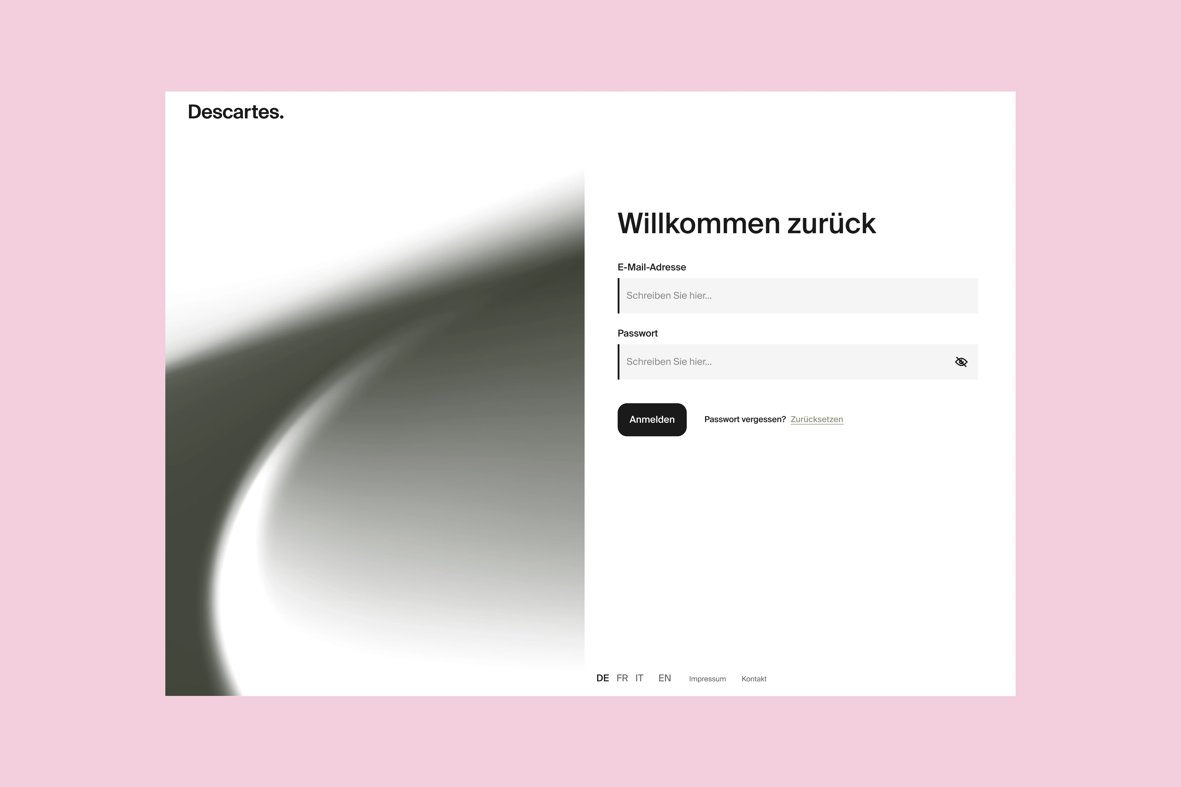
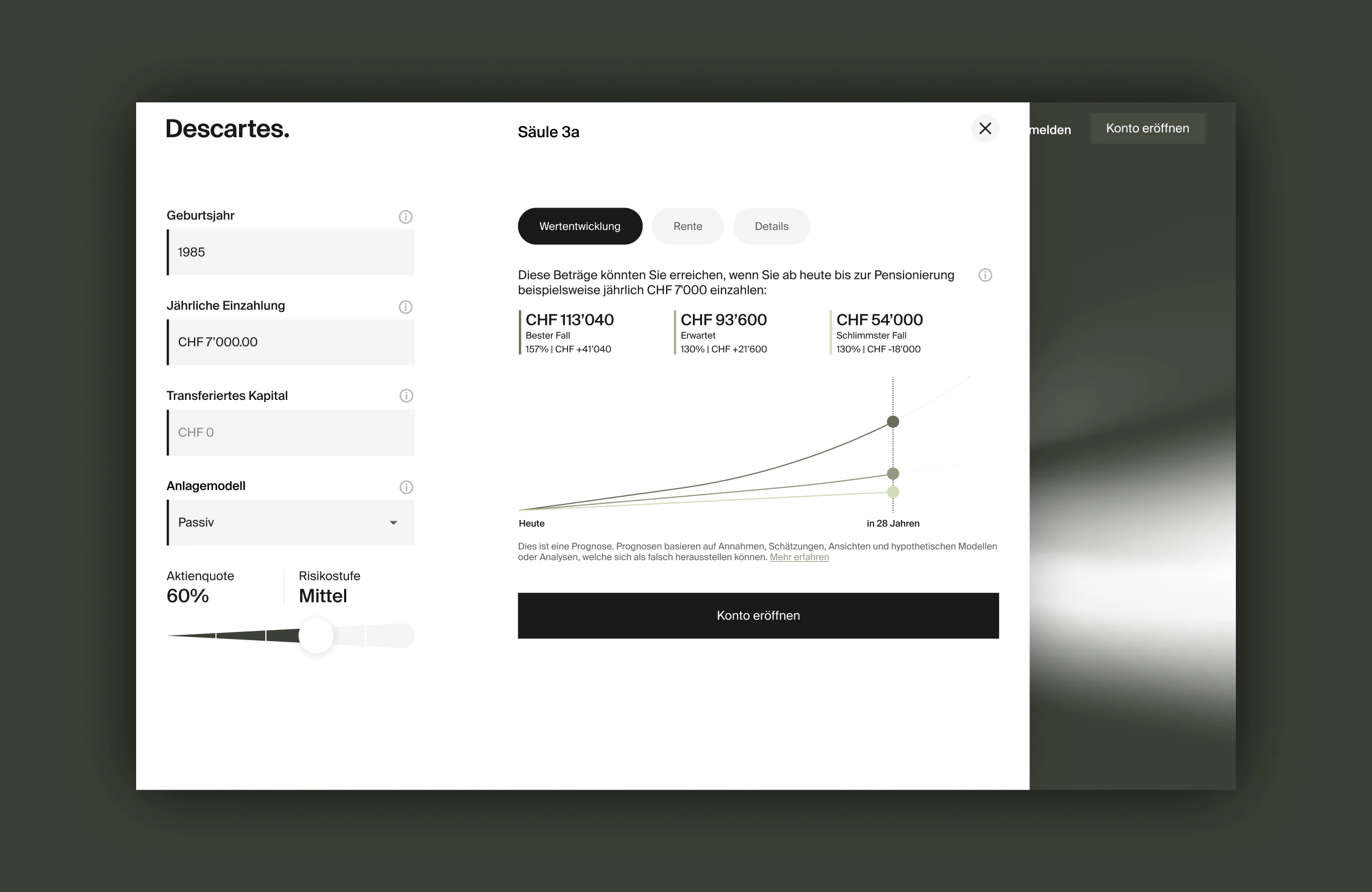
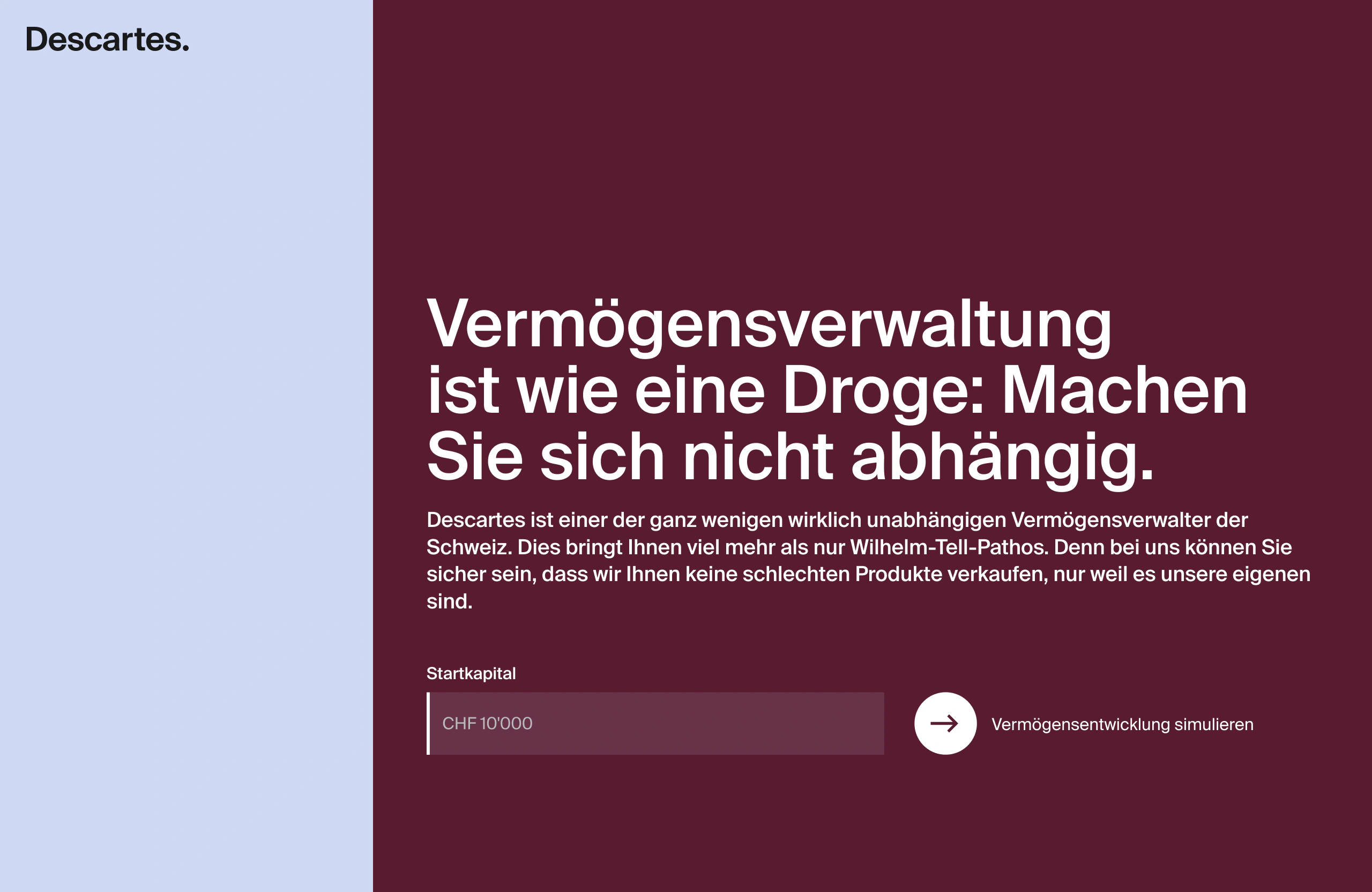
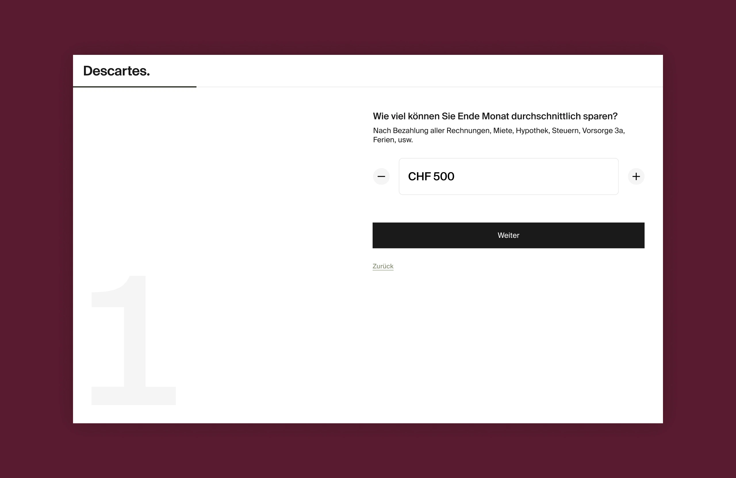
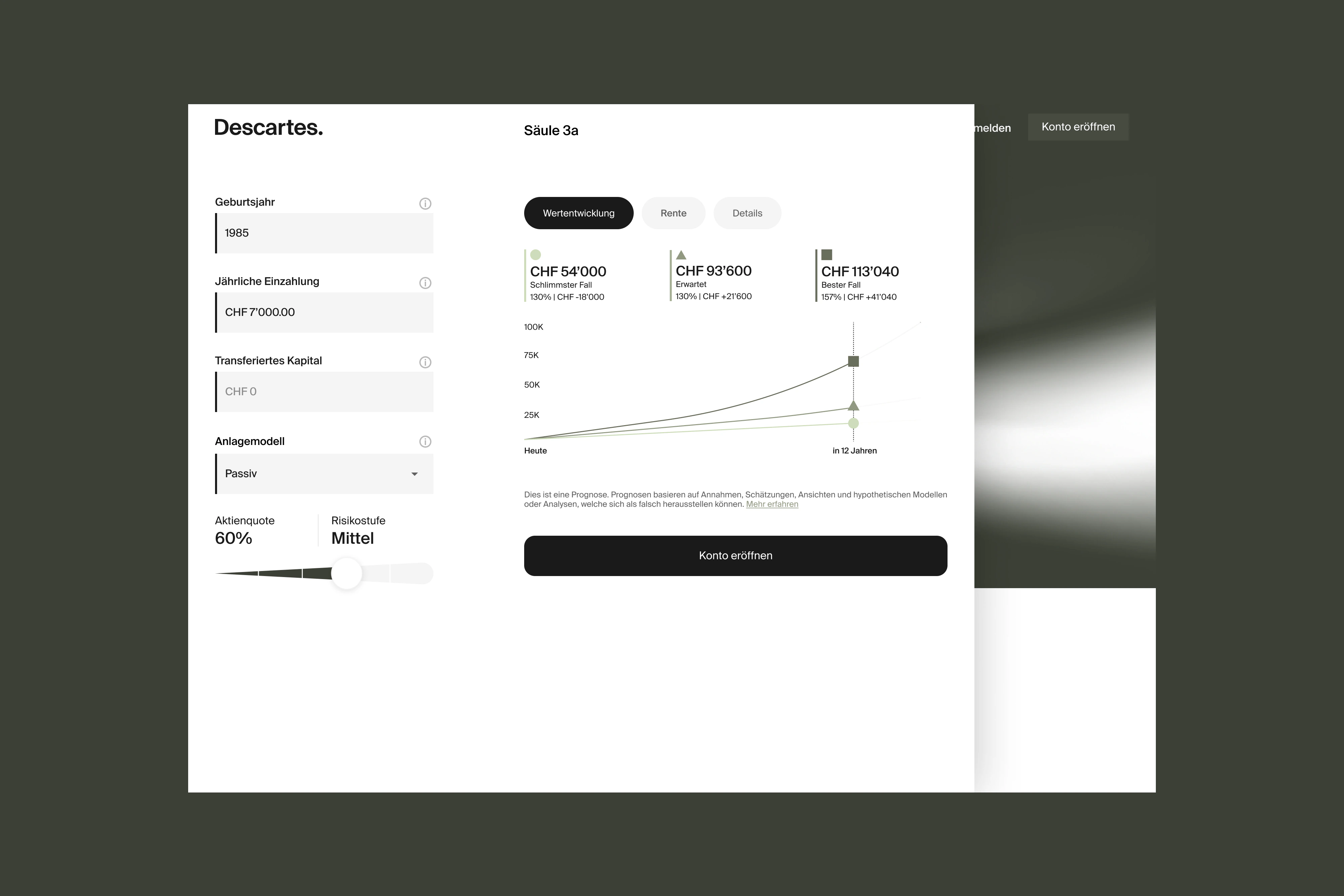
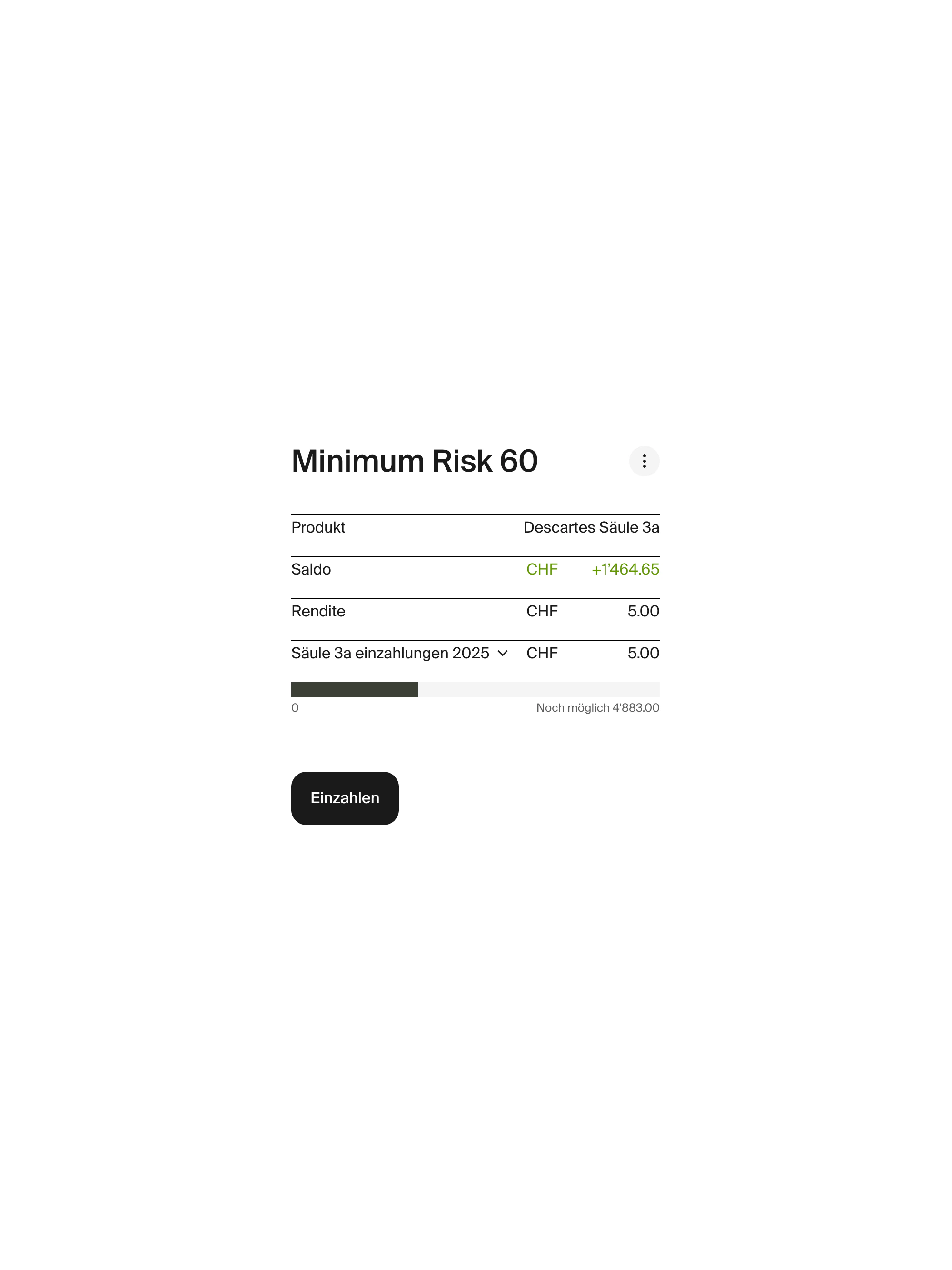
We refreshed the homepage so the story lands faster and the layout feels calmer to scan. We reworked how the AI on the site talks with visitors: clearer steps, less guesswork, fewer moments that feel like a demo taped onto a page. Visuals got a consistent pass so key templates read as one brand, not a stack of one-offs. Alongside that we tightened small interaction patterns and how those screens hold up on phone-sized viewports, where small friction shows up first.
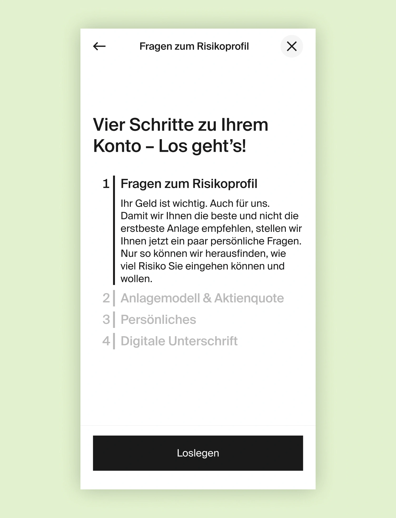
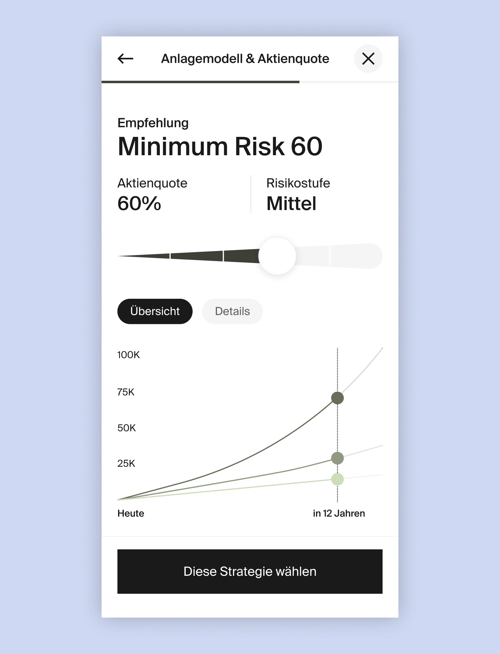
Onboarding and offboarding were already in place. Instead of reopening full journeys, we adjusted specific steps where users were hesitating so the team could keep shipping without a reset.
The blog structure was largely set. We refined filter behavior so narrowing and browsing posts asks for less fiddling. The deepest thread for me was the design system: components and rules had drifted, so I focused on naming, reuse, and handoff with Descartes and engineering. The goal was simple: fewer ad-hoc exceptions, faster agreement on what a screen is allowed to do.
None of this pretends the web was greenfield. It was iteration on a live product. A native mobile app was not out yet when this phase ran; that work is underway now. This case study stays with what we improved on the web and how it sets up what comes next.


This project may include subtle visual refinements to better reflect my current standards and the way I design today.