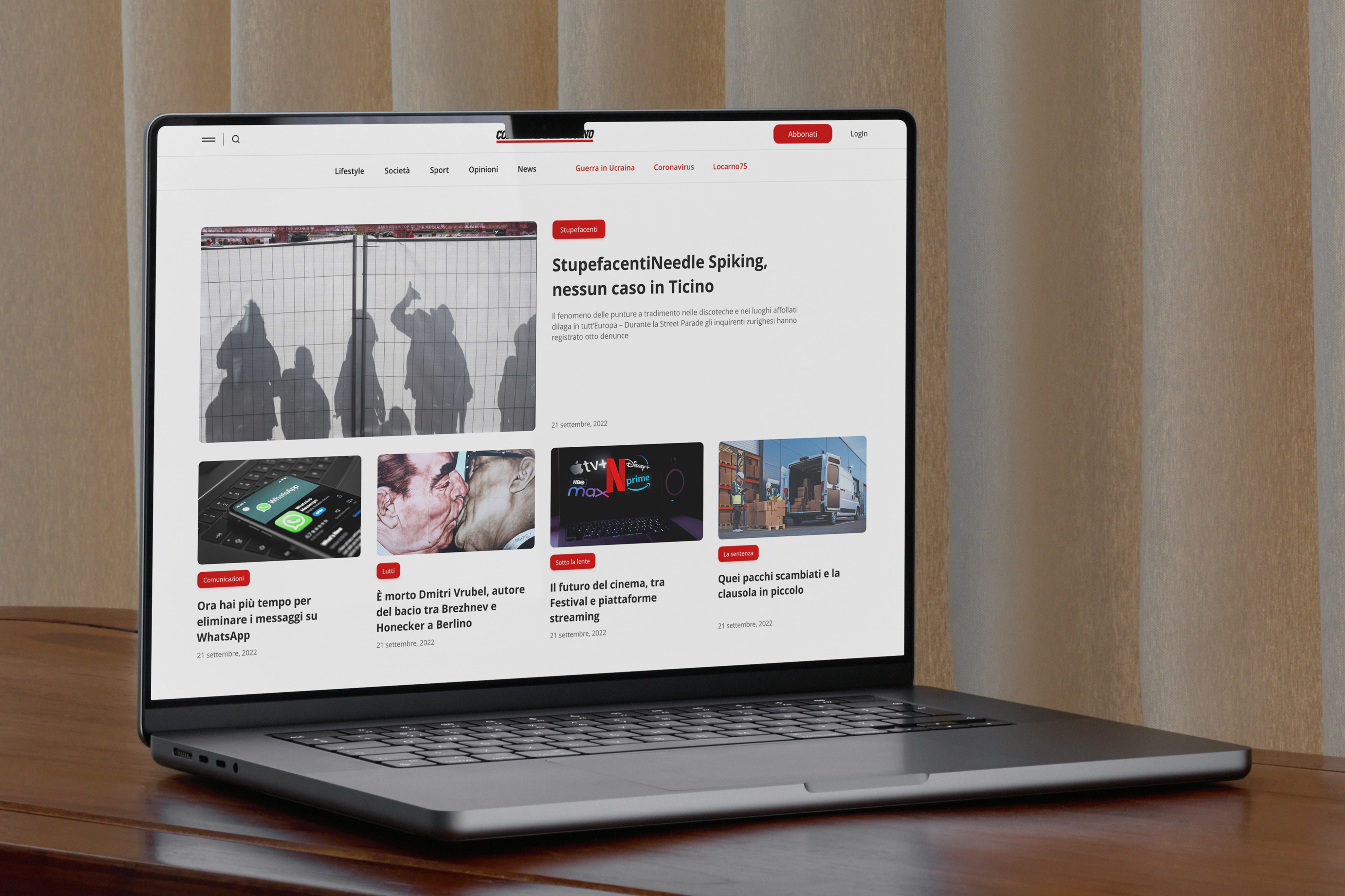
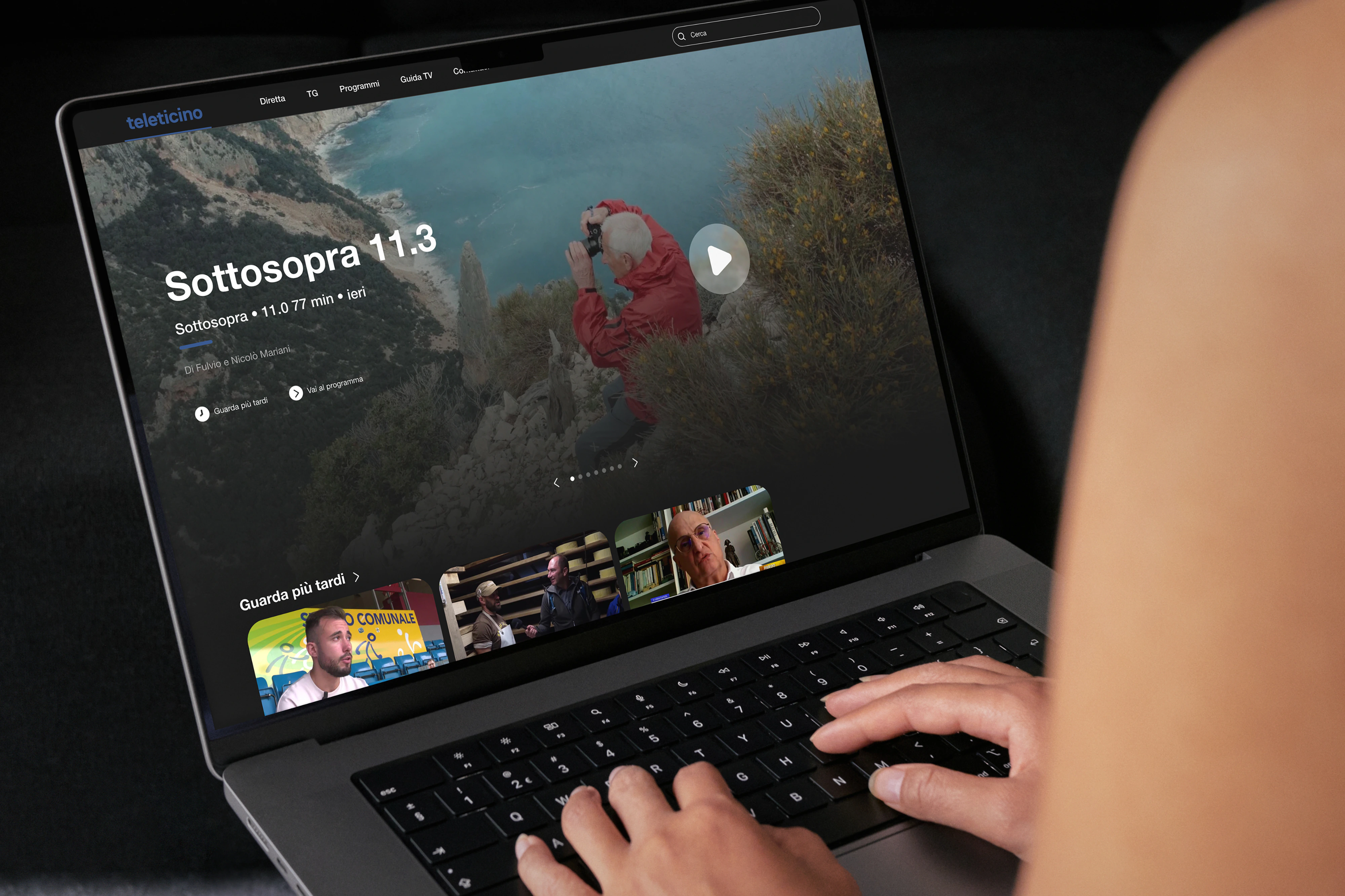
Two passes at Gruppo Corriere del Ticino: first, editorial sites that had to sound like the newsroom yet stay scannable on loud days; second, an app-shaped bet for events and dining when you’re actually planning a weekend in Ticino.
Two internships, two puzzles. First: concepts for two editorial sites (layouts and UI that carried the paper’s voice but stayed scannable when the news day spikes). Second: how to surface events and dining without tab sprawl. I watched how people browse and choose, then cut flows that felt fast and still believable for a brand readers already trust. Simone Marinelli and Manuel Antoniotti kept the work close to something you could actually build.
Font
Praho ProManualePrelo
Service
Design
Sevan Mammoli
Development